W.E.B. Du Bois was an early giant of the Civil Rights movement. He also has a New Haven connection, by way of his grandfather, Alexander Du Bois, who founded St. Luke’s Episcopal Church on Whalley Avenue, the third-oldest predominantly African-American Episcopal church in the nation. Encyclopedia Britannica lists W.E.B. Du Bois as a “sociologist, historian, author, editor, and activist,” roles that converge in one of three related exhibitions at Artspace, W.E.B. Du Bois, Georgia, and His Data Portraits, on view through June 26.
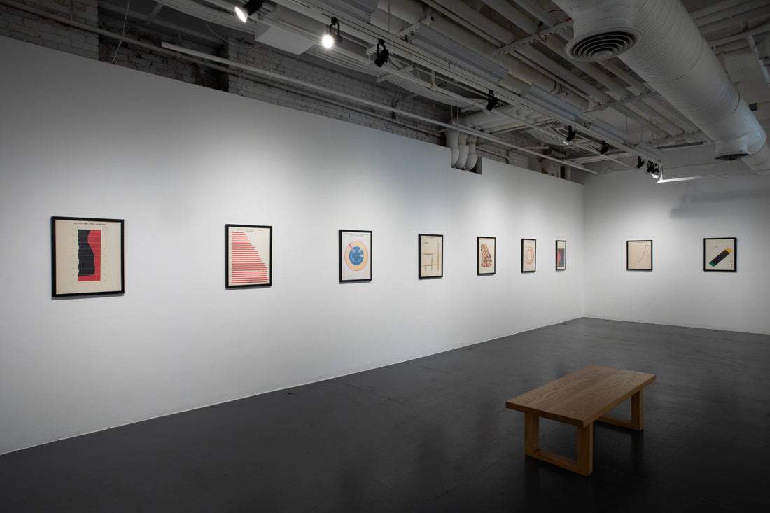
The 30 prints—called “data visualizations”—that make up the exhibition come from a set of 63 drawings belonging to the Library of Congress, which Artspace reproduced for this show. Du Bois made the originals with the help of Black students at Atlanta University for a display titled “Exhibit of American Negroes,” which was shown at the 1900 Paris Exposition. Written in both English and French, one of the original introductory posters describes them as “a series of statistical charts illustrating the condition of the descendants of former African slaves now resident in the United States of America.” Another poster explains, “This case is devoted to a series of charts, maps and other devices designed to illustrate the development of the American Negro in a single typical state of the United States”—that is, Georgia.
sponsored by

What follows is a collection of prints telling the story of “the American Negro” not only through data but also through color, shape and design that often stretches our conceptions of the usual bar graph or pie chart. One titled “Proportion of Freemen and Slaves Among American Negroes,” for example, begins with a simple line graph whose x-axis runs from 1790 to 1870 and whose y-axis traces population percentages. Du Bois flipped the graph, putting 100% at the bottom, thus orienting the visual toward the population of the enslaved, so the sudden change at the end of the Civil War becomes not a line shooting upward to 100% and freedom but rather a precipitous drop. As a result, the black-shaded section of the graph representing enslaved people looms like an ominous mountain on the page with a cliff at its right side.
The rest of the exhibition tells what happened next. Charts and graphs and maps present “Acres of Land Owned by Negroes in Georgia,” “Negro Property in Two Cities of Georgia,” “Occupations of Georgia Negroes,” and so on. Occasionally, a traditional presentation like the line on graph paper titled “Valuation of Town and City Property Owned by Georgia Negroes” turns up. But more often, Du Bois created visually interesting designs that draw the observer in for a closer look. For example, a bar graph titled “Assessed Value of Household and Kitchen Furniture Owned by Georgia Negroes” bends the colored bars into a complex spiral of ever-lengthening lines stretching toward an ultimately elusive center, from the pink stub of 1875 ($21,186) to the long red spiral of 1899 ($1,434,975).
A pie chart, too, takes on an intriguing design in “Occupations of Negroes and Whites in Georgia.” Here, Du Bois cut the sides out of the circle to display his color key, leaving the top slices (“Negroes”) and the bottom slices (“Whites”) to counterbalance one another like a topsy-turvy toy. The largest fields by far for both races are two fat, red wedges of “Agriculture, Fisheries and Mining” workers—62% for Negroes and 64% for Whites—which meet at the center like the points of a pinwheel. From there, the disparities spread out: Black people hold far more of the “Domestic and Personal Service” jobs, while white people hold more of the jobs in industry, the professions, trade and transportation.
sponsored by

In some cases, Du Bois is clearly making an argument with his data—for example, in a bar graph he uses to compare the rates of marriage (or “Conjugal Condition”) among different age groups for “Germany” and “Negroes.” The data shows Black people marrying earlier and becoming widowed or, in some cases, divorced earlier, but overall the marriage rates for the two groups are nearly dead even, which seems to be the point. In other prints, the data appears more academic—for example, when Du Bois charts the population of Black people in Georgia by county.
Either way, it’s no surprise that this body of work has inspired some current artists to pick up where Du Bois left off. In her accompanying exhibit In a Heartbeat, sculptor Dana Karwas uses not only Du Bois’s circular data charts as an inspiration but also his recently unearthed speculative fiction piece The Princess Steel, which “proposes a way to inspect the arc of civilization created using 200 years of data made up of ‘everyday facts of life,’” according to the exhibition panel. Using an EKG of a heartbeat as her starting point, Karwas created a pulsing video of Spirographic circles that shoot like projectiles from a center, stretching, drifting, tightening and wavering as if behind a curtain of heat. After repeated attempts to launch themselves forward, they retreat inward, shrink and appear to reset before blooming outward again.
That initial, untitled work is the basis for Counter-Curve (2021), a huge, grooved disc reminiscent of a vinyl LP but with a white, stuccoed surface marked with apparent imperfections like those that would make a record skip or repeat. Its concentric circles draw the viewer in, much as Du Bois’s drawings do, and set the tone for a kinesthetic piece, Arc of Near (2021), which also plays with circles and movement. This time, a black disc is hidden behind a rotating disc with a large circle cut in it. As the circular opening glides slowly over the design underneath, it allows us to glimpse not the full series of concentric circles scratched on the lower disc but merely their shifting parallel arcs, many of them marked by imperfections akin to those in Counter-Curve. As time elapses and the glossy disc rotates—it’s surely no accident that the direction is clockwise, nor that the surface behaves like a mirror—you might as well be watching the rising and setting, waxing and waning motion of the moon. Graphs, data, the passage of time, life itself—all are suggested by the mesmerizing movement of these works.
Mounted in Artspace’s corner gallery, where passersby can see it clearly and read explanatory labels on the windows, is Light of Progress—an exhibit of two neon signs by the sculptor and performance artist Theaster Gates that transpose two of Du Bois’s data visualizations. One is based on a bar graph titled “City and Rural Population 1890,” in which Du Bois bent the lines of a bar graph into a shape something like a musical note. A tight red spiral at the bottom represents the vast majority of Georgia’s Black population at the time—734,952 “Negroes living in the country and villages” versus 78,139 living in large cities and a smaller number in smaller cities. Lit up by Gates, this spiral becomes more insistent than its drawn counterpart, like a coil about to spring.
Gates’s signs are bright, sharp and even cheerful in their geometrical primary colors, but knowing the context behind them changes the experience. Du Bois’s prints are more than informative snapshots of a time long ago. They also raise inevitable questions about America today, the state of its Black population and how much has or hasn’t changed.
Artspace
50 Orange St, New Haven (map)
Wed-Sat noon-6pm
(203) 772-2709 | info@artspacenh.org
www.artspacenewhaven.org
Written by Kathy Leonard Czepiel.


